A chart shows China and India are leading in per capita carbon dioxide emissions.


Are China and India wildly outpacing the U.S., United Kingdom, Germany and Japan on emissions of carbon dioxide? A chart shared on Facebook shows a staggering increase in carbon dioxide emissions in China and India since 1990, while showing declines for the U.S. and other developed countries over the same time.
On Facebook, a user sharing the chart asked: "Why are we weakening our economy?" They cited the New York Post as the source.
The post was flagged as part of Facebook’s efforts to combat false news and misinformation on its News Feed. (Read more about our partnership with Facebook.)
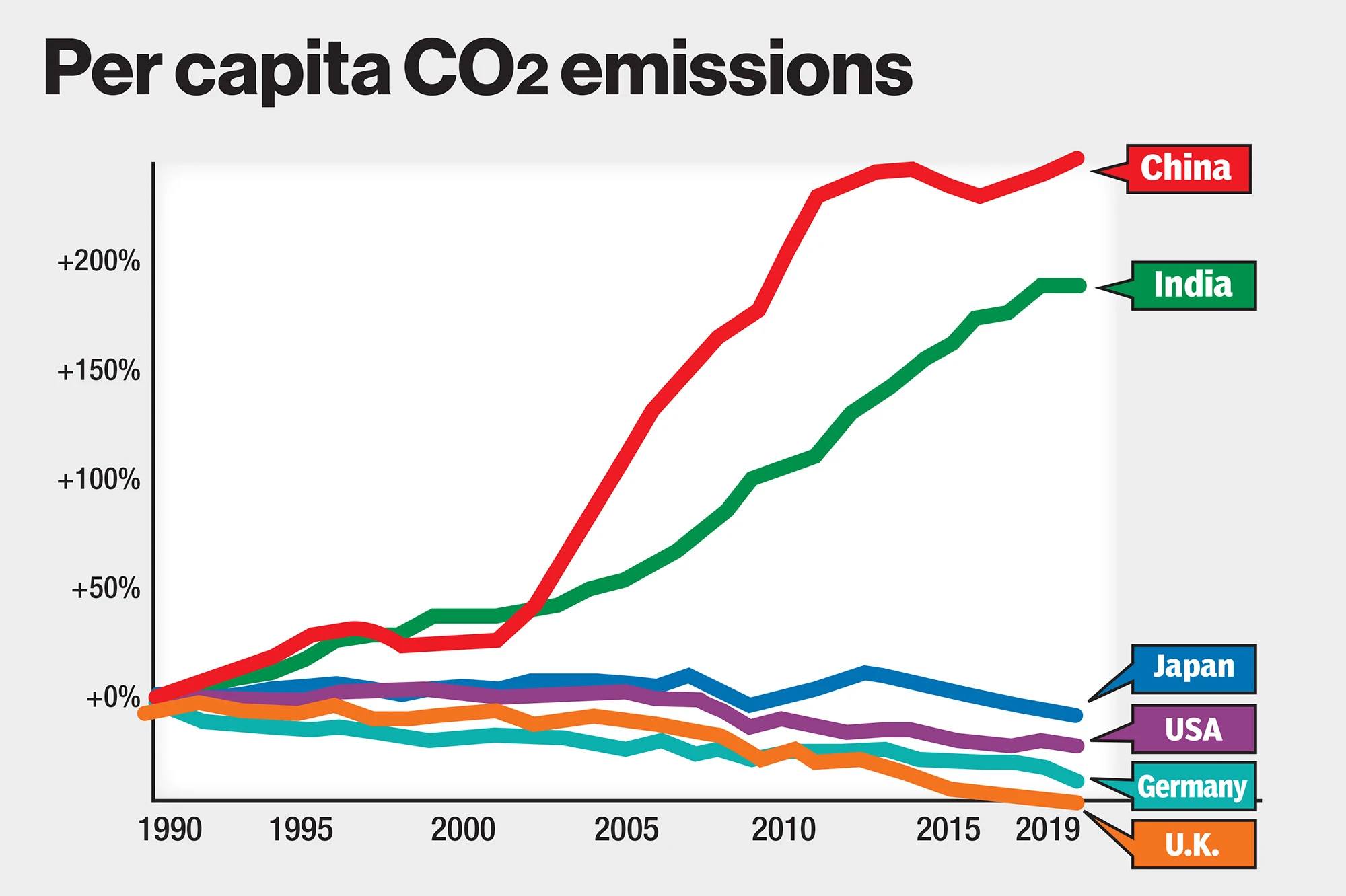
This is the image from the Facebook post, which originated from a New York Post opinion article.
It’s important to know what the chart shows, and what it doesn’t.
While the headline on the graphic says "Per capita CO2 emissions," what the lines on the chart show is the percentage change in CO2 emissions from 1990 to 2019 for China, India, Japan, the U.S., Germany and the United Kingdom.
It appeared alongside an Oct. 26 opinion article in the New York Post headlined "Why destroy our economy to cut emissions — when China and India are spewing away?" The piece ran ahead of the international climate change conference of world leaders in Glasgow, Scotland, called COP26.
The opinion article, written by Eddie Scarry, sourced the data in the chart from Our World in Data, an Oxford University project. So we asked Hannah Ritchie, a senior researcher for Our World in Data, to tell us more about it.
Ritchie offered a simple explanation: Because China and India had very low levels of per capita emissions in 1990, when their economies were far less developed, their emissions have grown a lot since then. Readers wouldn’t know it from this graphic, but the U.S., U.K., Germany and Japan already had high levels of emissions, which didn’t change very much over the same period.
A different way of looking at the data provides more context.
Our World in Data provided a similar chart looking at per capita CO2 emissions for the same countries and time periods. The difference in this chart is that it shows not the percentage change, but rather the actual change in per capita emissions over time, measured in tons. This version of how the data is presented shows the U.S. and Japan leading in per capita CO2 emissions.
The difference in charts from Our World in Data depends on whether the "relative change" option was selected. Checking this box shows the percentage change over time and makes it appear as though China and India are leading in CO2 emissions compared with other developed nations.
The Facebook post is missing context because it shows the change in emissions per person, but not the actual emissions.
The United States is responsible for the largest share of historical emissions with about 509 gigatons of carbon dioxide released since 1850. China has the second-largest share of historical emissions with more than 284 gigatons. Simon Evans, deputy editor for Carbon Brief, analyzed why cumulative CO2 emissions matter in an Oct. 5, 2021, article. He wrote:
"There is a direct, linear relationship between the total amount of CO2 released by human activity and the level of warming at the Earth’s surface. Moreover, the timing of a ton of CO2 being emitted has only a limited impact on the amount of warming it will ultimately cause.
"This means CO2 emissions from hundreds of years ago continue to contribute to the heating of the planet — and current warming is determined by the cumulative total of CO2 emissions over time."
A Facebook post shows China and India leading in per capita CO2 emissions compared to the U.S., U.K., Germany and Japan between 1990 and 2019.
The chart is missing some context, and the headline is misleading. When looking at the percentage change in per capita CO2 emissions from 1990-2019, China and India have seen the largest increases. Both countries had relatively low emissions in 1990, and they have grown a lot since then. The U.S., U.K., Germany and Japan already had high levels of emissions in 1990, and they have remained at high levels, with the U.S. leading the pack.
We rate this claim Half True.
Facebook post, Oct. 28, 2021
New York Post, "Why destroy our economy to cut emissions — when China and India are spewing away?" Oct. 26, 2021
Our World in Data, "CO2 emissions," last accessed Nov. 16, 2021
Our World in Data, "CO2 data explorer," last accessed Nov. 16, 2021
Carbon Brief, "Analysis: Which countries are historically responsible for climate change?," Oct. 5, 2021


In a world of wild talk and fake news, help us stand up for the facts.