
Our only agenda is to publish the truth so you can be an informed participant in democracy.
We need your help.
A reader sent us this chart detailing income growth in the United States, now and then. We checked the math to see if it was accurate.

A reader recently sent us a chart posted at the website of MoveOn.org, a liberal group. It aimed to show how incomes across the board rose from the end of World War II until 1979. But then, starting in 1979, they slowed for lower-income Americans while accelerating dramatically for the richest.
The graphic was produced by the group United for a Fair Economy, a group that "raises awareness that concentrated wealth and power undermine the economy, corrupt democracy, deepen the racial divide, and tear communities apart." Previously, we rated a bumper sticker the group produced.
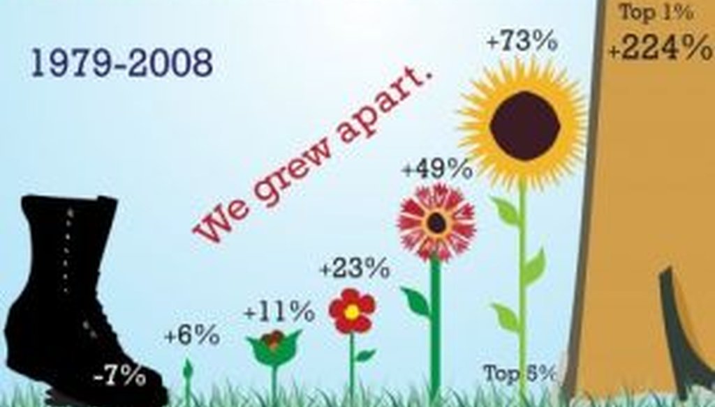
The group’s chart represents the growth in income for various income groupings as flowers, with the height of the flower proportionate to the size of the increase. The text says, "Comparing the growth of U.S. family incomes. 1947-1979 we grew together. 1979-2008 we grew apart."
The chart provided these statistics for the two periods:
1947-1979:
Bottom 20 percent of the income distribution: 118 percent increase
Second-to-bottom 20 percent: 100 percent increase
Middle 20 percent: 111 percent increase
Second-to-highest 20 percent: 114 percent increase
Highest 20 percent: 99 percent increase
Highest 5 percent: 86 percent increase
1979-2008:


Bottom 20 percent of the income distribution: 7 percent decrease
Second-to-bottom 20 percent: 6 percent increase
Middle 20 percent: 11 percent increase
Second-to-highest 20 percent: 23 percent increase
Highest 20 percent: 49 percent increase
Highest 5 percent: 73 percent increase
Highest 1 percent: 224 percent increase
We tracked down the raw data the group used for its calculations, and the group later confirmed that they had used the same statistics in assembling the graph. All but one of the categories -- the calculation for the highest 1 percent -- came from figures published by the U.S. Census Bureau, a source we consider reliable. For the 1979 -2008 Census data, the increases in the chart can be calculated directly. For the 1947-1979 Census data, the figures have to be reverse-engineered, but we were able to replicate the group’s methodology without much difficulty. In both cases, we used inflation-adjusted figures.
Ultimately, our calculations came up with some slightly different numbers, but the tallies were extremely close.
For 1947 to 1979, our increases ranged from 81 percent to 122 percent, depending on the income group, while United for a Fair Economy came up with a range of 86 percent to 118 percent.
For 1979 to 2008, our numbers ranged from a 4 percent decrease to a 73 percent increase, while United for a Fair Economy ranged from a 7 percent decrease to a 73 percent increase.
Since the numbers are close -- and more importantly, since they showed the same overall pattern -- we aren’t going to quibble over the differences.
And what about that final statistic, on the income growth for the top 1 percent from 1979 to 2008? The group pointed to data from economists Thomas Piketty and Emmanuel Saez, who have amassed a trove of data on income inequality.
We ran the numbers and came up with a 169 percent increase for the top 1 percent between 1979 and 2008. That’s less than the 224 percent indicated in the chart. The number is closer if you take the top half of 1 percent -- 213 percent. But even that doesn’t quite get you there.
Economists we contacted suggested that the numbers may have been adjusted to include capital gains, since the original Piketty-Saez data set excluded capital gains, and capital gains are an important income source for the very wealthy. But even if United for a Fair Economy’s final number is off, it’s still a whopping increase in income compared to the statistics for lower- and middle-income brackets.
We also checked with a range of economists to see if the comparison the group was making was somehow unfair. To one degree or another, each of our experts said the comparison was acceptable.
"My impression is that you would find basically the same story using any available tabulation of the inflation-adjusted income series for the U.S.," said Gary Burtless, an economist with the centrist-to-liberal Brookings Institution.
Eugene Steuerle, an economist with the Urban Institute, noted some methodological imperfections with these kinds of studies -- including their failure to account for the value of employer-provided health care and Medicare -- but he said he doesn’t doubt the overall trend.
"When all is said and done, there is fairly uniform consensus that starting in the late 1970s, the distribution of income in society became significantly more unequal," he said.
Two conservative economists -- Dan Mitchell of the Cato Institute and J.D. Foster of the Heritage Foundation -- raised some of the same methodological concerns as Steuerle, and they also warned against drawing broader conclusions than the data can support.
For instance, both noted that the chart, striking as it is, doesn’t say that someone in the lowest 20 percent is doomed to stay there. "When you add income mobility to the equation, the left's rich-get-richer-and-poor-get-poorer story gets rather blurry," Mitchell said.
Still, despite some modest differences in the final numbers, the story told by the United for a Fair Economy chart strikes us as pretty accurate. So we rate the chart Mostly True.
United for a Fair Economy, "Comparing the growth of U.S. family incomes," accessed July 1, 2011
U.S. Census Bureau, "Table F-2. Share of Aggregate Income Received by Each Fifth and Top 5 Percent of Families," accessed July 1, 2011
U.S. Census Bureau, "Table F-3. Mean Income Received by Each Fifth and Top 5 Percent of Families," accessed July 1, 2011
U.S. Census Bureau, "Table F-5. Race and Hispanic Origin of Householder--Families by Median and Mean Income," accessed July 1, 2011
Thomas Piketty and Emmanuel Saez, "Income Inequality in the United States, 1913-1998" (updated to 2008)," Table A4, accessed July 1, 2011
E-mail interview with Daniel Mitchell, senior fellow with the Cato Institute, June 10, 2011
E-mail interview with J.D. Foster, senior fellow with the Heritage Foundation, June 10, 2011
E-mail interview with Gary Burtless, senior fellow with the Brookings Institution, June 10, 2011
E-mail interview with Eugene Steuerle, fellow with the Urban Institute, June 10, 2011
E-mail interview with Timothy Smeeding, economist at the University of Wisconsin (Madison), June 12, 2011
E-mail interview with Shannon Moriarty, communications director for United for a Fair Economy, June 13, 2011


In a world of wild talk and fake news, help us stand up for the facts.