
Our only agenda is to publish the truth so you can be an informed participant in democracy.
We need your help.


A green map from 2017 and red map 2022 with summer temperatures show two different things in two different formats, though they appeared on the same TV show.
German public broadcasters shared weather forecasts that were produced by different offices before 2020, when they became standardized.
A red heat map seen in a 2022 forecast was also seen in 2017 on a similar show on public broadcasting.
The overwhelming consensus among scientists is that climate change is real and that it’s most likely caused by humans.
But many social media users are trying to convince others that the media is exaggerating climate change’s effects, with weather forecasts now showing normal summer temperatures in scary red colors to deceive viewers.
A July 22 Facebook post showing two maps reads "Proof that climate change is real. See how the map is getting more red???"
The maps appear as screenshots from two weather forecasts from Germany. The top image is from 2017 and shows temperatures on a green background. The bottom image is from 2022. It shows slightly lower temperatures on a map that is red, orange and yellow.
The post, which we found being shared in other social media posts, was flagged as part of Facebook’s efforts to combat false news and misinformation on its News Feed. (Read more about our partnership with Facebook.)
The post is misleading, said Sabine Renken, a spokesperson for Hessischer Rundfunk, a German public broadcasting corporation that leads the ARD Weather Competence Center. The center produces weather forecasts used in shows across ARD, an association of the nation’s regional public broadcasters.
The images, although from the same TV program, were designed to show two different things.
The 2017 image with its green coloring shows expected high temperatures for the next day. It’s a screen grab from a June 21, 2017, weather report on a daily news magazine broadcast called "Tagesthemen," which translates to "Daily Topics."
The green map was not designed to reveal anything about the temperatures, Renken told us. In the full video of that weather report, forecaster Claudia Kleinert points to additional graphics that show showers and thunderstorms, wind direction and the forecast for the next few days, with temperatures cooling, over the same green background.
The 2022 image with the red background similarly shows the next day's highs — this time on a color-coded heat map that was designed specifically to show a change in temperatures across the day. It appeared in a June 20, 2022, weather report from "Tagesthemen." Video shows that just before she showed the red map, she pointed to cooler early morning temperatures in green.
The red, orange and yellow heat map was part of a change in graphic format implemented in 2020, according to a spokesperson for the broadcaster that produced the weather segment.
"Until 2020, there were no uniform weather forecasts in the ARD," Renken said. She said the weather reports were supplied by different editorial offices and companies and looked different in different broadcasts.
Hessischer Rundfunk took over production of the weather forecasts in January 2020, Renken said, and the design and presentation were adapted for the broadcasts then.
Renken disputed the notion that the two different maps show a conspiracy by weather forecasters to push a climate change agenda.
"The two graphics differ in design and presentation. Until the end of 2019, the temperature maps supplied in the "Tagesthemen" only represented the temperature in numbers — the green background had no relation to the temperature," Renken said.
In fact, in 2017, a weather report on a separate public broadcasting news program called "Tagesschau," a daily newscast that appears on the same channel and uses the same set as "Tagesthemen," showed the same style of map as those shared in this post, with a green background to show lower temperatures early in the morning, and then transitioned to red to show the weather warming during the day.
Many weather forecasts traditionally use colors to differentiate between cold, moderate and hot temperatures.
A look at the national forecast on July 25 from The Weather Channel, which is based in the U.S., shows the color red being used to show warm temperatures, with pink used for extreme heat and yellow and orange for milder temperatures.
Weather Central uses a similar color scheme, as does the National Weather Service, though red there is reserved for temperatures exceeding 100 degrees. WGN-TV, a Chicago station, uses a similar method to differentiate temperatures.
Renken pointed us to a 2019 article from an ARD fact-checker that debunked a similar claim about maps from 2009 and 2019 that alleged that "Tagesschau" was manipulating them to exaggerate the effects of climate change.
A Facebook post claims that green and red colors showing temperatures in two different weather maps five years apart in Germany show the media is manipulating the maps to push a climate change agenda by adding red to make it seem hotter.
But the maps in the post show two different things — one, from 2017, shows a general weather forecast on a green background; one, from 2022, shows only temperatures on a red background. The earlier green background had nothing to do with the temperatures, while the red background in 2022 did.
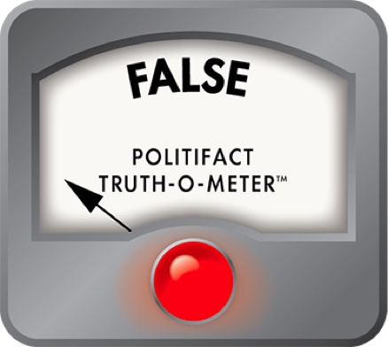
We rate this claim False.
PolitiFact developer Mark Wirblich contributed to this report.
Facebook post, July 22, 2022
Email interview with Sabine Renken, spokesperson for Hessischer Rundfunk, July 26, 2022
Tagesschau, "Lots of hot air around the weather map," (translated from German), May 6, 2019
"Tagesschau," June 20, 2017
"Tagesthemen," June 21, 2017
"Tagesthemen," June 20, 2022
"Tagesthemen," Jan. 24, 2022
Hessischer Rundfunk, "Hessian broadcasting starts ARD weather competence center," Dec. 11, 2019
In a world of wild talk and fake news, help us stand up for the facts.