Get PolitiFact in your inbox.
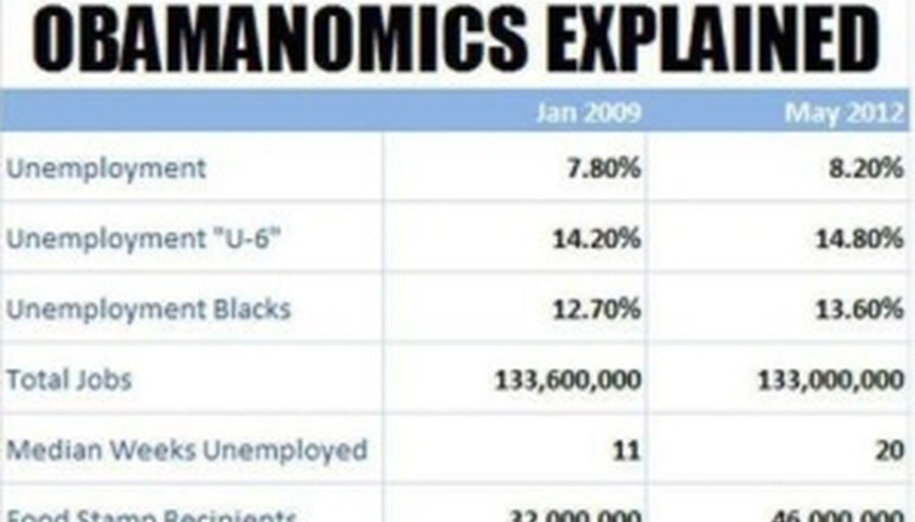
This chart is being widely posted on Facebook, but it's not ours.

We've gotten many inquiries today about a chart being widely circulated on Facebook. It has the PolitiFact logo and is headlined "Obamanomics Explained."
But "Obamanomics Explained" is not a PolitiFact chart and it improperly uses our trademark. It also selectively takes statistics from our work. We have asked the Tea Party Express to remove it from the group's Facebook page, where one version has appeared.
Here is the full report that we published in June, a lengthy scorecard examining the economy under President Barack Obama.
If you see a copy of the chart in your Facebook news feed, we suggest that you not share it and ask the person who did to delete it.
UPDATE, July 18: The Tea Party Express has removed the image from its Facebook page. "We apologize for this oversight and the post and picture the has been removed from our page," spokesman Taylor Budowich wrote to us.
Our Sources
PolitiFact