Stand up for the facts!
Our only agenda is to publish the truth so you can be an informed participant in democracy.
We need your help.
I would like to contribute
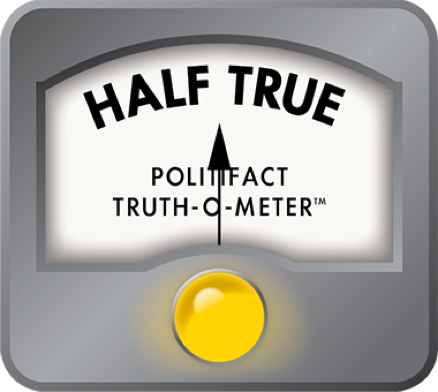
Oregon State political scientist Robert Sahr devised this comparison, folding in fiscal years completed under President Obama, in July 2012. To download an Excel version, try the link at the end of our story.
In a Democratic U.S. Senate debate, former legislator Paul Sadler said government has to get federal spending under control.
"Until we get our financial house in order, we cannot continue to spend money. We just can’t."
The U.S. has "never seen national debt like this," Sadler said. "It doubled during the Bush administration."
His doubling claim proved Mostly True.
Our analysis, posted to the right, was helped along by guidance from Oregon State University political scientist Robert Sahr, who studies U.S. debt, policy, presidents and inflation, who urged us to focus on inflation-adjusted changes in the public debt.
Gross federal debt rolls in all the money the federal government owes itself, including for programs such as Social Security and Medicare, in addition to public debt. Public debt is only that debt held by the public in money borrowed from investors outside the federal government, in the form of Treasury notes and other securities.
At our nudge, Sahr also delivered a chart showing percentage changes in the public debt under each president from Harry Truman through George W. Bush. We earlier posted it as a factual keepsake.
Readers followed up, wondering if we could fold in comparable information for the completed portion of Barack Obama's term. Sahr pitched in to provide us with a chart showing changes in the debt -- from Truman into Obama's tenure. It's right above this text.
We recognize the chart, formatted to fit our space, is hard to read. To download a more readable Excel version, click here.
Our Sources
See Triuth-O-Meter article.


