Stand up for the facts!
Our only agenda is to publish the truth so you can be an informed participant in democracy.
We need your help.
I would like to contribute
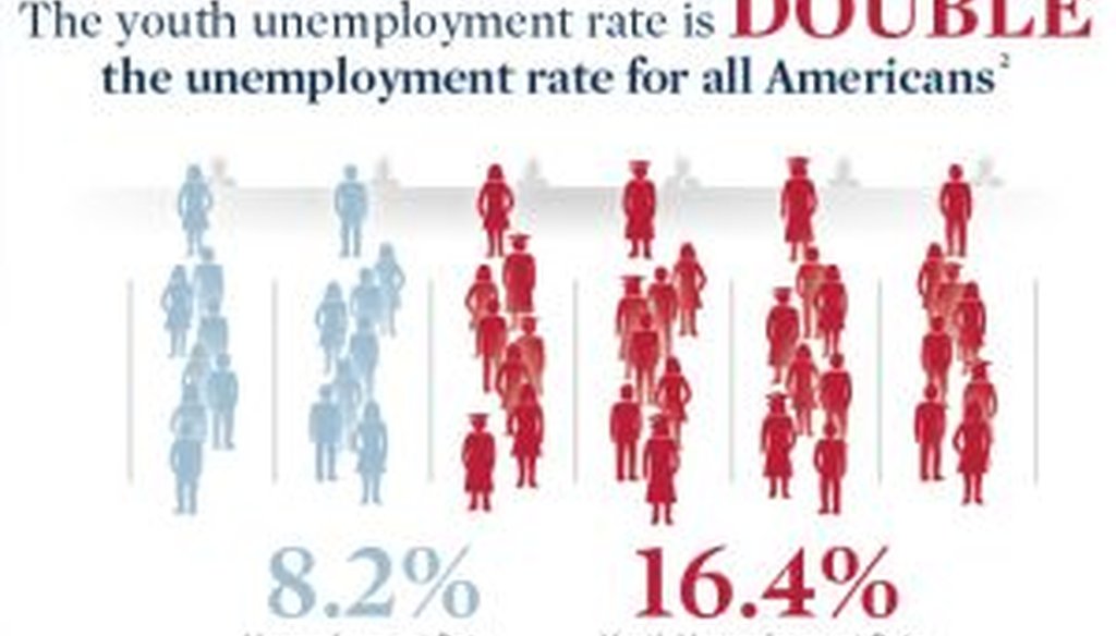
This is part of an infographic released by the Mitt Romney campaign that seeks to attack President Barack Obama's record on jobs for younger Americans.
As he struggles to overcome deficits among key demographic groups, Mitt Romney is consistently wielding one weapon: "infographics" chock full of statistics that seek to undermine President Barack Obama’s record on the economy.
First came women. Then Hispanics. And now youth.
The most recent chart, on youth employment, claims that in the "Obama economy ... the youth unemployment rate is double the unemployment rate for all Americans."
We found that Romney had a point that young Americans are hurting in today’s job market. But he bolstered his argument with a questionable statistic: Youth unemployment has consistently been double the overall rate all the way back to 2001, when George W. Bush was president. We rated the claim Half True.
On Hispanic employment, the Romney infographic said that "the total unemployment rate for Hispanic or Latino workers has increased from 10% to 10.3%" between January 2009 and March 2012.
The numbers the Romney team cited are accurate, but they may not be statistically significant, and if you switch the time frame by just one month, the numbers tell a dramatically different story -- one much more favorable to Obama. These amounted to missing critical facts that would have given a different impression, our definition of Mostly False.
Finally, we checked two claims from the infographic on women.
The first was a claim on the campaign website that "women account for 92.3 percent of the jobs lost under Obama." We found the claim misleading and ruled it Mostly False.
The second claim was that Obama "has the worst record on female labor force participation." We found there was a grain of truth to the claim but not much more. Our ruling: Mostly False.
Our Sources
See original Truth-O-Meter items.


